It’s nothing new. People have been banner blind long ago. Creating banners that get clicks requires some skills. Today we will discuss what they are.
(Disclaimer: I’ll be using sample banners to illustrate my points. They are for educational purposes. Please don’t be offended if you are the owner/creator of these banners).
1) Headline is the magnet
Like copywriting, everything begins with a headline that attracts people’s attention.
It can be something that is thought provoking or something that can trigger people’s desire. For example,
“Guaranteed Profits From The Stock Market???”
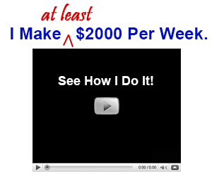
“I Make At Least $2000 Per Week. See How I Do It!”
It’s okay to exaggerate as long as you can back up what you said.
Below is an example of a banner that is too conservative. Such a banner is not likely to stir much excitement.

2) Call for action is the bait
The wordings in a banner should be kept to the minimum. You are likely to have a headline, which I’ve explained earlier, followed by a call for action.
The objective of a headline is to get people to READ. The objective of a call for action is to get people to CLICK.
So what makes people click? The trick is to create an expectation.
The call for action should give the audience something to look forward to. That ‘something’ must be so vivid that if they don’t click the banner, they will feel like they are missing out on something. For example,
“Get 20 Free Insurance leads.”
“Free Video Shows You How.”
Think out of the box when it comes to the call for action. See the example below. The call for action is an image of a video pending to be played. Some people may be so used to clicking the play button that they may subconsciously click on the button.
3) Forget about banner, think about links
People are banner blind nowadays, but they are not link blind. This means when they see words like ‘click here’, a hyperlink, a download button, or even a video play button, they click.
If you want your banner to get clicks, you need to make your banner look like a link, rather than a banner.
This is an example of a professional-looking banner.

This is an example of a link-looking banner.

Which one do you think will get more clicks?
4) Use graphics with purpose
I’m not against graphic, but we need to know what’s the purpose of using graphic in a banner. The purpose of using graphics is to gain attention.
See the example below:
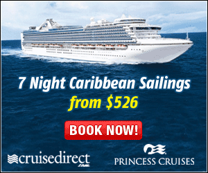
Whoever looking for a holiday or cruise vacation will be attracted to see what this offer is about.
Here’s another good use of graphics, which shows the before and after of using the product.

5) Keep it simple
The last key I want to emphasize is try to keep your banner ‘clean’. Don’t pack it with lots of graphics and wordings such that at one glance, it’s hard to tell what you are trying to offer.
Here’s an example of what I mean.

The banner above is full of words and graphics. Do you find it confusing at first glance?
How about this example:
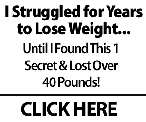
It has a good headline that will catch the attention of people having the same problem. It has also created an expectation of ‘1 secret that can lose over 40 pounds’. Last but not least, its bold design makes it stands out from the rest of the professional-looking banners. It may be ugly and simple, but I’m quite sure it gets clicks.
Banner creation is not rocket science. If you follow the above tips, you too can create effective banners.
That was a very educational article on how to explain the way to use banner ads effectively to get clicks. I think another thing that people use wrong on their banner ads is use slide shows. I say this because alot of times them slide shows go too fast and I can’t read the message before it slides to the next message and it just frustrates me and I will just move on. So if anyone is doing this on there banner ads they might want to re consider it.
Great post. I also find that text banners with great headlines and call to actions get me the most clicks.
In this post, Kenneth as usual, provides useful, right to the point information. It’s like getting a comprehensive banner how-to course.
Hi Kenneth:
Interesting post. I personally don’t like much banner advertising. It takes generally thousands and thousands of impressions to get a very few clicks. And, about your post, I had no idea of those links-looking banners. Certainly I will make tests with them. I am hoping that they really can get more clicks.
Regards,
Jesus M.
Very useful information for everyone! Thanks
Awesome Post Kenneth, I’ve been testing new pages utilizing banner placement. So far I’ve placed a banner to the upper right of my content, and the call to action banner at the bottom of the content as opposed to anchor text. Which do you think is getting more clicks? ;-) So far the call to action banner is performing awesome! I’ve also found that using a “title” AND “alt” tag will not only help optimize the images for SEO but also help increase the click rate.
Thanks Ken – kinda clears up the silly rumor about banner blindness hey
Too right Kenneth, the first banner is too conservative (and the person is also probably slightly uneducated (or LAZY) as well,) I mean who places a Banner with stupid spelling mistakes in them???? DUH!
I personally do NOT click banners or links with spelling mistakes, even emails with typos get the instant delete button, I mean if they can’t be bothered checking their work what TRUST do they deserve from me? Will their stuff be any good anyway?
This may be slightly off the point here but RELEVANT to advertisers!
Cheers from Oz
Hi to Deagan Smith (who belittled US that care about such stuff with ridicule) after making the same errors in ads… LMAO
Nice post Kenneth. After all it’s all about AIDA (Attention, Interest, Desire, Action).
Hello Kenneth, God Bless you
Great Tips and Great Examples about how to Create Banner that get clicks. I Going to try it out
Thanks for the great article again!
Wonderful article ,this is helping me.Thanks for sharing this article.
Fine :-)
As usual….
Nice And Good Useful This Articles Thanks For Sharing This
Thanks for Sharing Kenneth,
Great article to read and thanks for the update.
Ed
P.S.
Like the new layout of the site, that’s not to say your last layout was not good enough LOL
Very Helpful Article. I have been trying to create clickable banners.
Great post ken. I will be using what I learned here when I develop Banners.
nice post thanks u so much
Thanks kin for the great tips. Gonna design banner for my new site now.
This website is great. I cant believe how much information they give away for free. The owner of this site has something very special here. I love this community and all of the members here want to see you make money.
Very useful article, was looking for this information
Thanks for the informative post. I think your point about simpler banners with fewer elements is extremely important. Sometimes we just like our banners to look nice…even if they are unsuccessful. Thanks, again, for the insights. – Edgar
very nice tips for banners, because creating them it’s not the job done, they job is done when they are clicked and ROI.
nice topic
thanks for the informative post. I admire those who can construct a banner that grabs attention.
Having the right tools is key to constructing a profitable and successful banner campaign.
Thanks for sharing nice post.
You did an excellent job with this article, Kenneth. Keep Up The good job :)
I have often wondered how to make banners that will actually work. I have learned something today, thanks.
Great Blog
Your blog is really interesting and inspiration to many. I’ll be looking forward for more of your posts. Keep it up! Thanks for share..
Thanks for update!!!
I find animated banners get more clicks than static ones for obviously reasons. People’s eyes are attracted to movement. It’s usually about 400% more clicks.
It is good to research the psychology of colors. Your banner colors are very important. Though high color and contrast work, it does turn some people off so be prudent.
You should only stick to one benefit that you use to draw people in. Your banner is your first level marketing filter and once people click, psychologically they want to get value for the click they just ‘spent’.
Because banners are cheap, it is a good area for new marketers on a budget. It’s also a good way to test a new site.
Very informative, I took notes lol. I thought it was very educational for newbies. You explained it so it’s very understandable. Ty